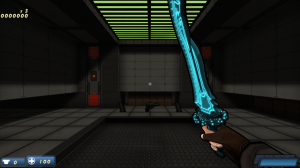
There’s definitely something I haven’t gotten right with the levels. It’s really hurt the visual quality of the game, and I’m almost ashamed that it didn’t dawn on me earlier to do something about it. So, what is it exactly that I’ve screwed up so royally and that you should totally learn from? Well, in case you didn’t read the title of the article, the answer is… CONTRAST!
Contrast is one of the seven principles of design. They’re the principles that help guide what makes visual arts interesting. If you have a work that follows them, you’re likely to have something that’s awesome to look at. If not, you’re likely to have something dull and boring. There are entire college courses dedicated to this subject (I should know! I took one!) so all seven is a bit much to talk about in one blog post, but briefly, they are:
- Balance
- Rhythm
- Emphasis
- Variety
- Contrast
- Harmony
- Unity
FUN FACT: Neither “photorealism” nor “high poly count” are on this list!
In case you were wondering, contrast is “a striking exhibition of unlikeness”. Basically, it means you should try to mix things up. The same way there’s nothing interesting about hearing a constant buzzing sound (just ask those with tinnitus!), there’s nothing too interesting about looking at a blank white wall.
If your brain can’t pick out any meaningful information, it goes to sleep. By spicing things up, suddenly there’s meaningful information, and your mind is awake and interested!
So what does this have to do with Wrack? There was a major lack of contrast – specifically in the lighting. While tossing my sanity to the curb and braving the dreaded YouTube comments section, I came across what user “valcaron” had to say:
The level design generally looks very promising, though some dynamic lighting … and contrast would enhance the tension significantly — it kind of looks “samey” everywhere.
“samey” – as in, the EXACT OPPOSITE of contrast! And you know what? I don’t blame him at all for saying that! Here’s the start room of the latest public build of E1M4:
Notice anything? Notice how the lighting is basically completely even all the way through? Notice how even the colors are pretty much entirely the same? YUCK! Aside from the ambient occlusion and the bloomed orange bars, this is extremely boring in terms of lighting and color. With Wrack’s texture artist Remco Ernst houding me about how badly this start room sucks… I decided to finally do something about it!
To fix this, I put in a skylight. First, this adds some color to the room. The green sky is a much welcomed change of pace in terms of color, and it also shines a greenish light into the room which is noticeable when the lights aren’t super bright (which happens elsewhere in the map). Not only that, but it completely changes how light enters the room. Instead of it coming from slightly below the ceiling and basically illuminating the entire room evenly, it’s forced to come in through a hole in the ceiling, which results in… shadows! The end result… is this!
… ah, much better!
So, what do you all think? How does contrast improve games? Which games do it great? Which don’t? How can you use this to improve your maps? Feel free to share!


This is actually one of the problems I was going to mention next time I talk to you; it’s something in particular that bugged me about the visuals in E1M4. The entire level is pretty much only black, grey, and orange, which makes it hard to distinguish one room from another at times. Glad to see you’ve already begun solving this.